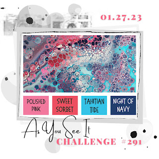
As always, after our sketch challenge comes a colour challenge. What a vibrant and interesting mix Joanne has given us!
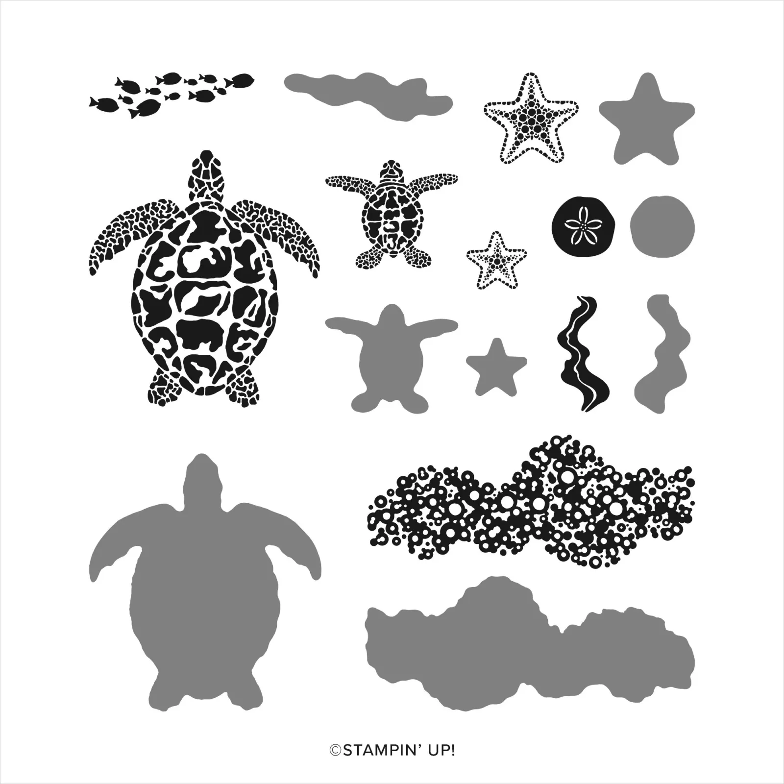
Perhaps not everyone would see it this way but to me it looked like a marine colourway. Maybe I was unjustly influenced by the new Sea Turtle set that just happened to be on my desk. 😀
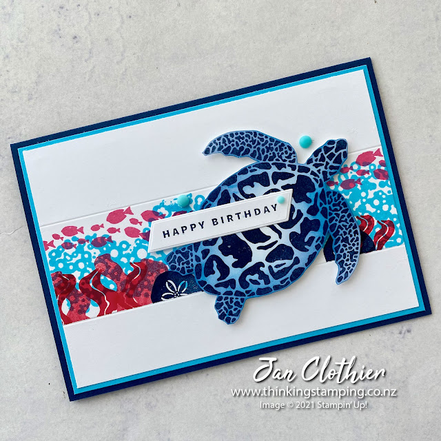
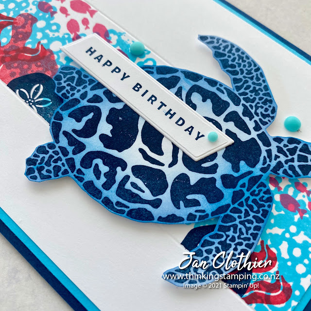
I masked off a strip about 4 cm wide and went to town creating an underwater scene. As this stamp set is reversible, I created some wildly waving kelp in Sweet Sorbet, using both sides (and both ends) of the stamp. The water, stamped in Tahitian Tide, I'm really pleased with. I also like the Polished Pink school of fish and the Night of Navy sea urchins.
The sentiment and label are from the Something Fancy bundle. I added in some 2022-2024 Matte Decorative Dots in Tahitian Tide to finish the design off.
Don't forget to visit the As You See It page to see what the rest of the team have done with this sketch and to share your own take on the sketch. We'd love to see how YOU see it.
If you live in New Zealand and don't have a Stampin' Up Demonstrator, I'd love to be yours. I can help you with ideas, get you catalogues and provide you with Stampin' Up products. You can leave a message in the comments or contact me using any of the methods listed in the Contact Me tab at the top of the page. You can shop with me from anywhere in New Zealand by clicking on the SHOP NOW button in the sidebar or on any of the products below.


love how tropical you have made your design concept look, just as one would image some untouched tropical Island underwater sea life could look like
ReplyDeleteThank you! That's just the idea I wanted to convey. Your comments are so very kind .
ReplyDeleteFabulous card, Jan! I love the stamped panel - it's such a fantastic effect x
ReplyDeleteThis has such an exotic, tropical look Jan! I love how that stamp set can create such a unique horizontal band of bright, but not overpowering colour, and still let the sea turtle dominate! Amazing card!
ReplyDeleteThe scored lines don't detract from what is an absolutely fabulous card Jan! These colours work perfectly for your underwater scene and whilst I loved the turtle in this set, I was put off by the reversible style and so dismissed it. I am now taking a second look! The layering of images in the central panel is so effective and the turtle on top makes me want to grab my wetsuit and a tank and head off to the Caribbean for some scuba diving for sure!
ReplyDeleteThis card is so fantastic, Jan! I love the underwater scene you created with this beautiful color combo and that turtle is amazing!!! I definitely "need" to get this set :)
ReplyDeleteJan - you were on point with the colors and the images! Once you said marine colorway - I went - I see that! And why didn't I think of that! Stunning!
ReplyDelete